|
Our Estate wine labels are commissioned artworks by Dianne
Gardner of Port Orchard. When I first saw her work my attention
was immediately grabbed by her portraits. You can see more of her
work at her website:
http://www.gardnersart.com/.
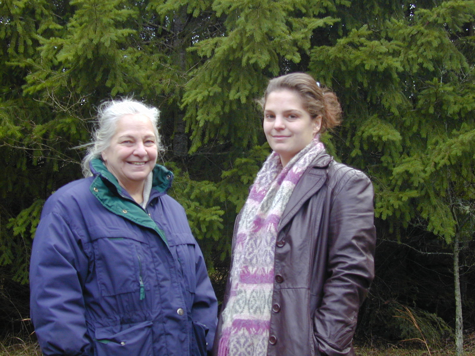
 This is Dianne with her daughter Ruth West, who is the model for
the lovely lady in the Müller Thurgau and Madeleine Angevine
images. (Photo taken on a cold winter day so we're all huddled in
thick jackets, by MikeL - 12-Dec-2006.)
This is Dianne with her daughter Ruth West, who is the model for
the lovely lady in the Müller Thurgau and Madeleine Angevine
images. (Photo taken on a cold winter day so we're all huddled in
thick jackets, by MikeL - 12-Dec-2006.)
(full size image 421Kb .jpg)
|
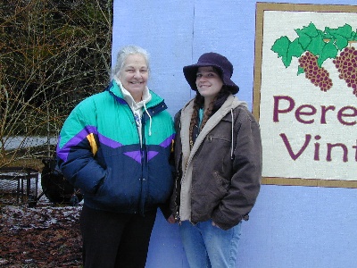
 And this is Dianne with her other daughter Mary, who is the model
for the lovely lady in the Melon de Bourgogne image. (Again,
photo taken on a cold winter day so we're all huddled in thick
jackets, by MikeL - 09-Feb-2009.)
And this is Dianne with her other daughter Mary, who is the model
for the lovely lady in the Melon de Bourgogne image. (Again,
photo taken on a cold winter day so we're all huddled in thick
jackets, by MikeL - 09-Feb-2009.)
(full size image 408Kb .jpg)
|
The artworks were each done entirely by Dianne. The bordering,
choice of fonts and wording that reduce the beauty of the overall
work were done entirely by Mike Lempriere --
apologies for my lack of artistic sensitivity. All the originals are
on display in our humble winery --
please come visit us to see them.
Below are the pieces and their stories, in the order they were created.
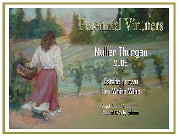 Müller Thurgau
Commissioned in 2006 for our dry white wine made from 100% Muller
Thurgau grapes.
First used on the vintage 2005 release.
Copyright © 2006 Perennial Vintners.
I asked Dianne to use our vineyard as the basis of an image for the
label and left it pretty much at that. The final piece was simply
a more thorough version of her initial piece -- although I didn't
really know what I wanted, she found it!
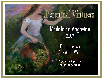 Madeleine Angevine
Commissioned in 2008 for our dry white 100% Madeleine Angevine
grape wine.
First used on the vintage 2007 release.
Copyright © 2008 Perennial Vintners.
Upon finishing our second wine, I asked Dianne for another work in
the style established with the first piece both artistically and
thematically. With a little back-and-forth on the lovely lady (I
felt she had to have longer hair), we arrived fairly directly at
this image.
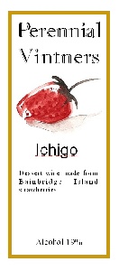 Ichigo
Commissioned in 2008 for our strawberry port-style dessert wine.
First used on the 2008 release.
Copyright © 2008 Perennial Vintners.
"Ichigo" is the Japanese word for strawberry -- with this release
we honored the Japanese/American strawberry farming heritage of
Bainbridge Island. As the wine is packaged in a narrow 500mL
bottle (click link above to see bottle photo), there was very
little room for detailed artwork. These constraints brought Dianne
to do this simple Sumi-styled strawberry.
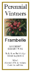 Frambelle
Commissioned in 2008 for our raspberry port-style dessert wines.
First used on the 2008 release.
Copyright © 2008 Perennial Vintners.
This is a small bottle (same as Ichigo above) with very limited
space for artwork. "frambelle" is a made-up word combining the
French words for raspberry (framboise) and beautiful (belle). I
told Dianne about the wine and she provided exactly what was
needed, a beautiful cluster of raspberries.
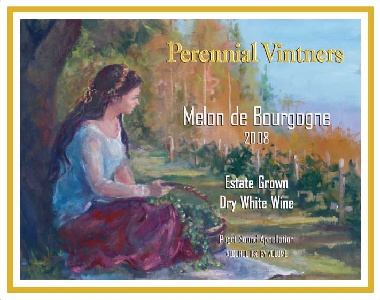 Melon de Bourgogne
Commissioned in 2008 for our dry white 100% Melon de Bourgogne
grape wine.
First used on the vintage 2008 release.
Copyright © 2008 Perennial Vintners.
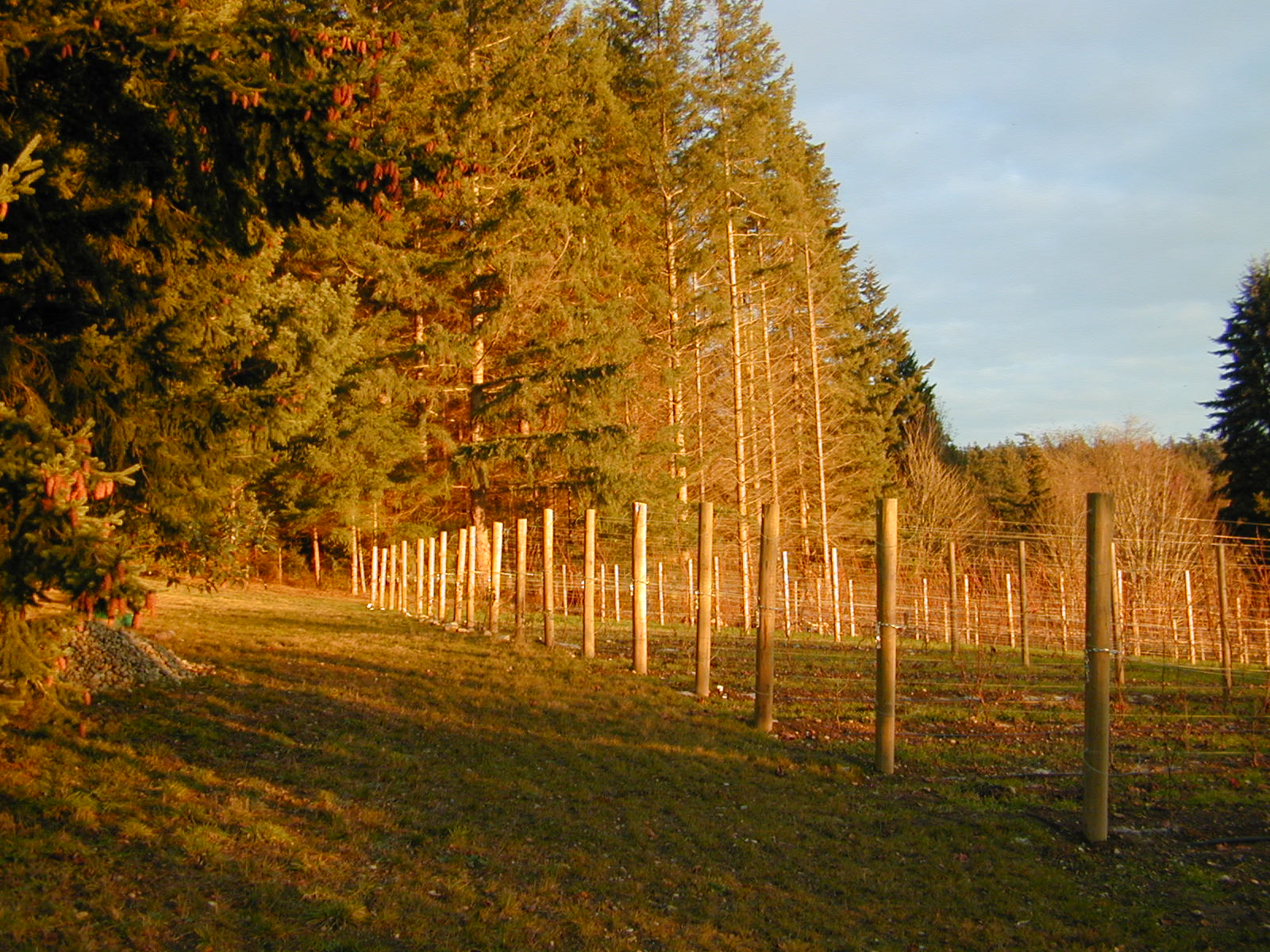
 Our third white table wine was a longer time in coming as we had to
start by planting a vineyard, growing the grapes for 4 years, then
making the wine for a year... Dianne and I agreed that we should
continue with our "girl in the vineyard" theme. Dianne looked
through the PV website, and found a photo I had made a year or so
earlier of our vineyard, and she based this piece on that. I was
thrilled as I recognized the basis of the image immediately as
being my vineyard! As requested, she made the bare winter scene
into a much more attractive harvest scene.
Our third white table wine was a longer time in coming as we had to
start by planting a vineyard, growing the grapes for 4 years, then
making the wine for a year... Dianne and I agreed that we should
continue with our "girl in the vineyard" theme. Dianne looked
through the PV website, and found a photo I had made a year or so
earlier of our vineyard, and she based this piece on that. I was
thrilled as I recognized the basis of the image immediately as
being my vineyard! As requested, she made the bare winter scene
into a much more attractive harvest scene.
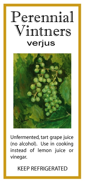
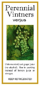 Verjus
Commissioned in 2009 for our verjus (unfermented tart grape juice
used for cooking).
First used on the 2009 release. (There was a previous release in
2008 that had a text-only label.)
Copyright © 2009 Perennial Vintners.
This is a small bottle (same a Ichigo above) with very limited
space for artwork. In the same vein as the Frambelle (above),
Dianne provided a cluster of grapes just as they look when ready
for use in verjus.
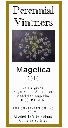 Magelica 2010
Commissioned in 2012, for our Magelica dessert wine.
Only used on the 2010 Magelica release. This was a one-time only
wine, I don't expect we'll ever have the weather conditions to do
this wine again.
Copyright © 2012 Perennial Vintners.
I asked Dianne if she could do an Angelica flower... The printing
on the label came out poorly, dark to almost black & white - in
the artwork the background is a deep rich purple.
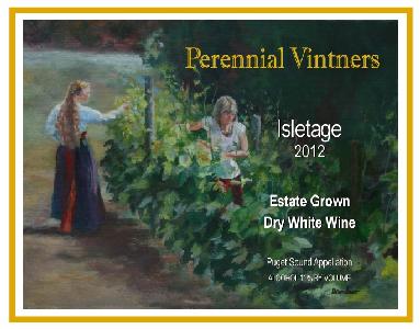 Isletage 2012
Commissioned in 2013, intended for use on our first release of
Siegerrebe. However, difficult growing conditions in 2012 left us
with a lovely blend of wines instead of a varietal.
First used on the 2012 Isletage release.
Copyright © 2013 Perennial Vintners.
Dianne brought the lovely models to the vineyard for the artwork.
As we used this artwork on a wine that is a blend of multiple
grapes, it works out really well that there are two lovely ladies
in this while all our others have just one.
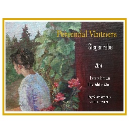 Siegerrebe 2014
Commissioned in 2015, for our first release of Siegerrebe.
First used on the 2014 Siegerrebe release.
Copyright © 2015 Perennial Vintners.
I appreciate the dark vineyard post area to the right, allowing the
label writing to be more clear. I also adore how she managed to
bring my row-end roses into this image.
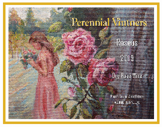 Roseus 2019
Commissioned in 2019, for our first estate release of a Rose'-style wine.
First used on the 2019 Roseus release.
Copyright © 2019 Perennial Vintners.
I love how Dianne managed to bring together the old gnarled
vineyard post, yet keeping a mostly consistent color, as with the
Siegerrebe image, allowing the label writing to be more clear. I
also row-end roses. The young lady holding the flowers completes
the image wonderfully.
|
